BRANDING & STRATEGY | WEB | VIDEO | PRINT
..............................
The Challenge
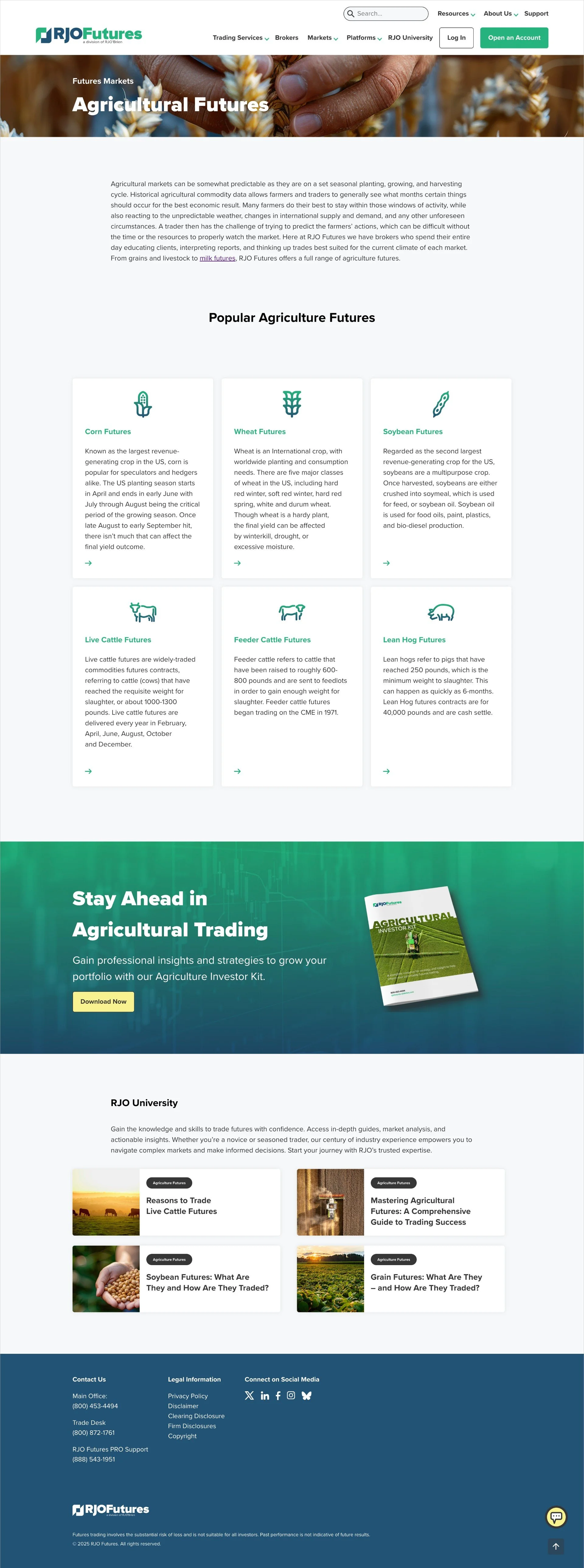
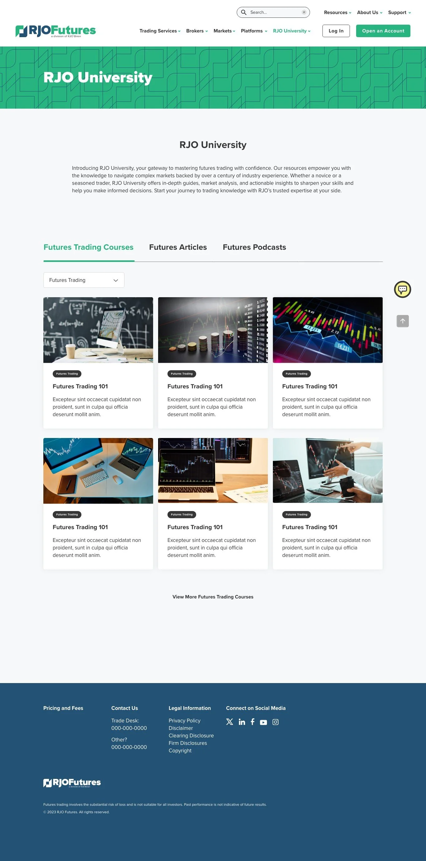
RJO Futures needed a clearer, more relatable brand to reach middle-class investors. Their identity lacked emotional connection and was getting drowned out by flashier, high-risk competitors. The goal: position RJO as the smart, steady choice in futures trading.
The Approach
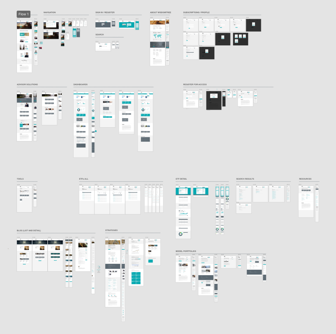
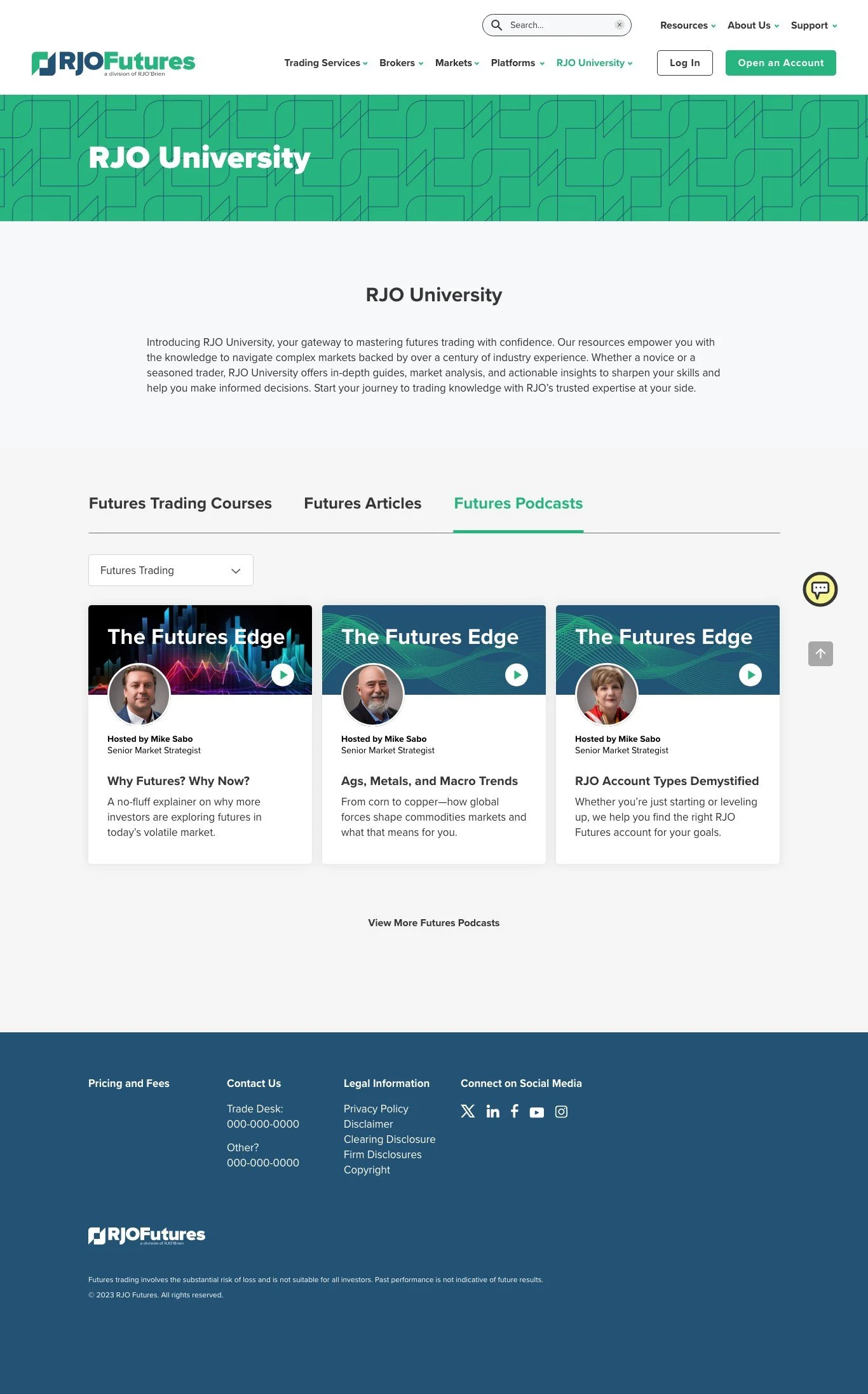
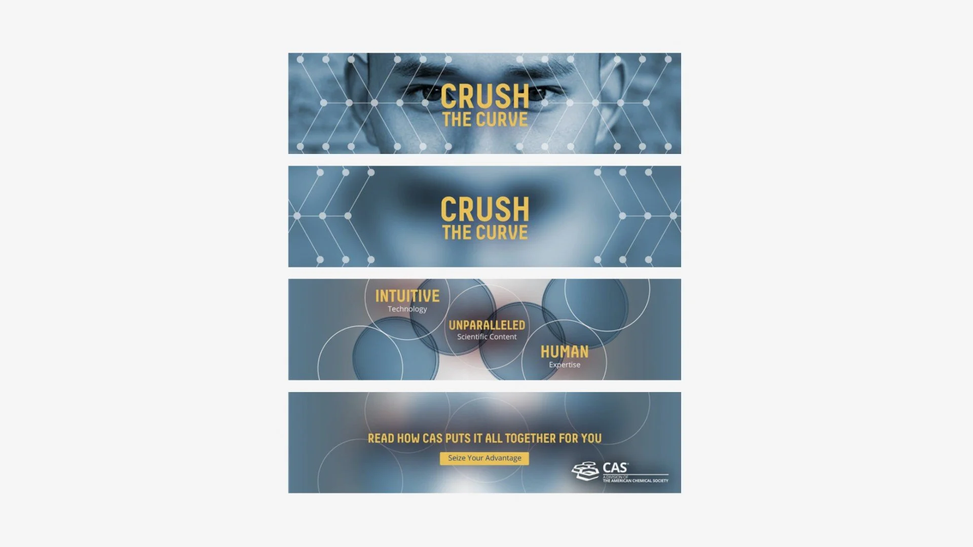
I led a brand workshop to define RJO’s voice and differentiate them as “The Sage”—a trusted, strategic guide. We applied user insights to reshape messaging, UX, and visuals around clarity, trust, and purpose. I created the brand line “If it’s Futures, it’s RJO” to unify the narrative across paid media, content, and site experience.
Results
Compared to the same period last year, the new brand and campaign drove meaningful performance gains:
• +29% increase in qualified leads year-over-year
• Cost per lead decreased 4.6%, improving overall efficiency
• Funded accounts nearly doubled in value, with the average account size increasing 263% (from $49K to $178K; adjusted: +89%)
• Lead-to-account conversion rate hit 3%, signaling stronger funnel performance
• Brokers reported more productive conversations and a noticeable shift in client engagement, as prospects arrived better informed and more confident in RJO’s expertise
The Outcome
The new brand positioned RJO as a trusted, strategic player—leading to warmer leads, smarter conversions, and real ROI traction. Design elevated credibility. Messaging connected. And the strategy delivered.
Visit website